TIQ marketing website 2020 redesign
When TIQ started approximately 5 years ago, we had a very basic marketing website that grew over time. In 2017 we have done a big overhaul, but that’s already 3 years ago. But as the company grew, so did the requirements for the marketing website.
This post is a writeup about the goals, results and considerations that went into the redesign of the TIQ marketing website in 2020.
Note: this is the second writeup about the TIQ marketing website. In case you’re interested where we’re coming from, the previous version of the marketing website has been documented in my previous writeup.
Goals for the 2020 redesign
- Implement a fresh graphic design: It’s been three years since we’ve visually upgraded the TIQ marketing website, but we’ve grown significantly as a company. A good opportunity to make sure our visual identity aligns with our current position in the market!
- Implement a Content Management System (CMS): We’ve postponed using a CMS for as long as possible to keep the development fast and easy, but with frequent updates this approach no longer aligns with our marketing goals.
- Put all content under one roof: The blog and marketing website used to be separate locations during the startup op the company.
- Provide a place for premium content: Over the years we’ve gathered a lot knowledge and experience about time tracking and we offer a collection of premium content, such as whitepapers, e-books and case studies. They have grown to be the most important content we have to offer on our marketing website, so they needed a better place.
The 2020 graphic design
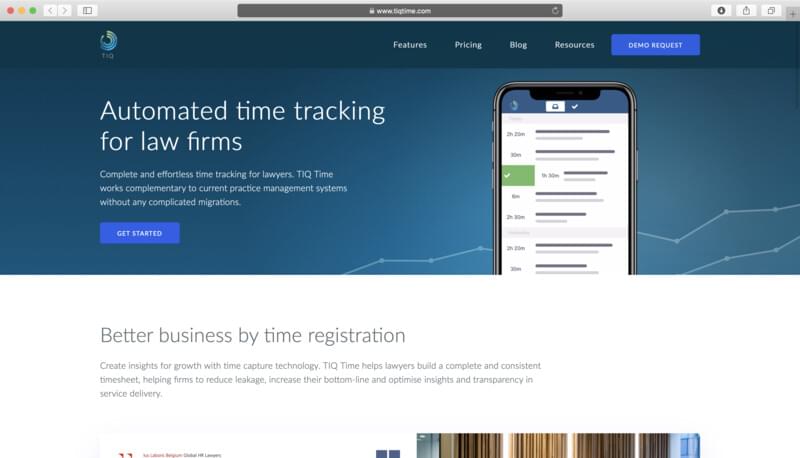
The homepage of the new TIQ marketing website
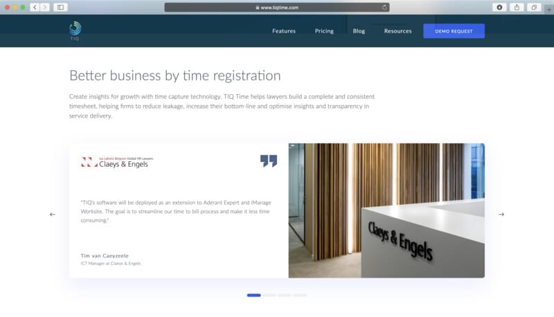
Customer testimonials have a prominent place on the homepage, right under the fold. It features a custom built slider in pure Javascript.
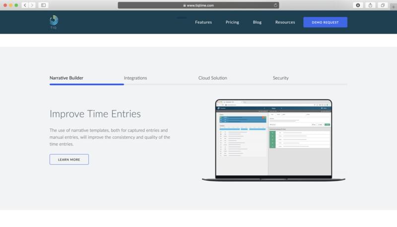
TIQ’s features are explained in a slideshow, again in a custom slider. All slides link to additional information to optimize clickthrough rates.
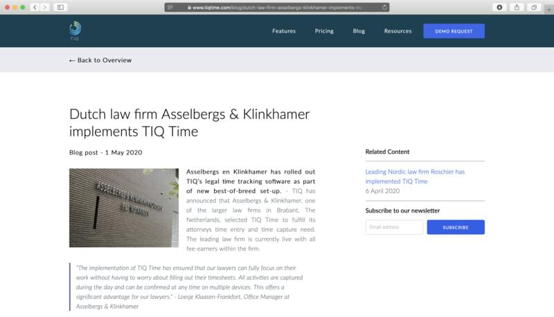
The blog has been integrated into the main website and the old posts have been migrated. It’s designed as a “reader view” with the focus on clean, readable typography suitable for longer texts.
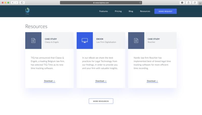
Downloadable resources are a big part of our marketing campaigns and have a clear location on the new website.
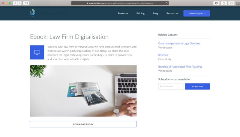
Download page for a selected resource.
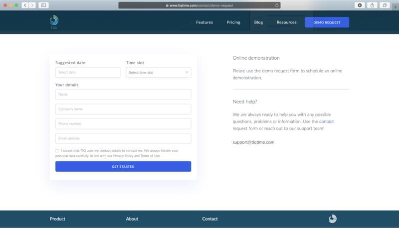
The redesigned demo request form.
Craft CMS as an alternative to Wordpress
As I explained earlier, we decided to implement a CMS after 5 years. Now, I have plenty of experience with Wordpress and I’m not a fan. Wordpress has grown from a blog platform to a platform that does it all. But under the hood it’s still a blog platform first. In the past I usually ended up spending way too much time hacking Wordpress to get what I want. It was time to try something different.
After extensive searching, I stumbled upon Craft CMS. This offers exactly what I couldn’t get in Wordpress:
- “Bring your own template” platform
- Well-structured back-end with as few assumptions as possible
- High quality interface for creating content and management
- Some basic plugins for SEO
I’ve set Craft CMS up as a Docker container running on Azure with automated backups and thus far it’s holding up really well.
Update: I’ve written a blog post about Running Craft CMS in a Docker container on Microsoft Azure.
Migration from Google Analytics to Matomo Analytics
As part of the new website, we have also taken a good critical look at alternatives for user insights. I’ve written a separate article about this: Lessons learned: upgrading visitor privacy with Matomo Analytics.
My responsibilities
- Graphic design tweaks (the base design is made by my colleague Bas Roodbeen)
- Web design (UI/UX)
- Front-end development
- Back-end development